Bespoke Market Analysis Issue (January 2017)
eBay’s new logos:
eBay have been experimenting with a range of new colour palettes for their iconic logo
The original logo ![]() seemed quirky, fresh and exciting when it first appeared back in 1995, but by 2012 it was looking dated and naïve. The new logo
seemed quirky, fresh and exciting when it first appeared back in 1995, but by 2012 it was looking dated and naïve. The new logo ![]() reflected eBay’s sleek growth and signalled its repositioning as a marketplace which had something for everyone – not just car boot bargain hunters.
reflected eBay’s sleek growth and signalled its repositioning as a marketplace which had something for everyone – not just car boot bargain hunters.
In recent years eBay has worked hard to attract a new demographic of buyers, who want new items and a wide choice. It’s no surprise then that they are experimenting with different colour schemes in different parts of the Internet.
This does seem to fly in the face of conventional wisdom about building a brand, which revolves around retaining and promoting a unified presence in terms of appearance.
However. eBay has never been afraid to take a controversial position on received wisdom, and it is now apparently using very different colours on different parts of the web –
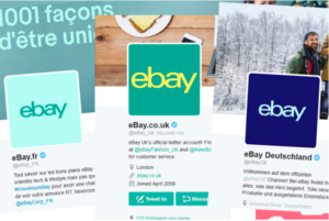
The iconic font shape is the same, and the general pantone of colours are also the same, which makes it surprisingly easy to recognise.
This may be of use if you are considering upgrading or changing your own logo, especially for use on the Internet. The Web is so vast that different buyers may not even notice that your colours are different as they may never see more than one – this is perhaps what eBay is utilising.
So take a few moments to think about where you might want to use a new logo. Will it be roughly square (long rectangular logos are always tricky to use on the web). What colours will it be and will it create a good watermark for images? Can you adjust the colour palette for various use cases? And as always, most importantly, what does your logo say about your brand?